artist: EXIT
title: THE BLIND ALLEY
year: 2013
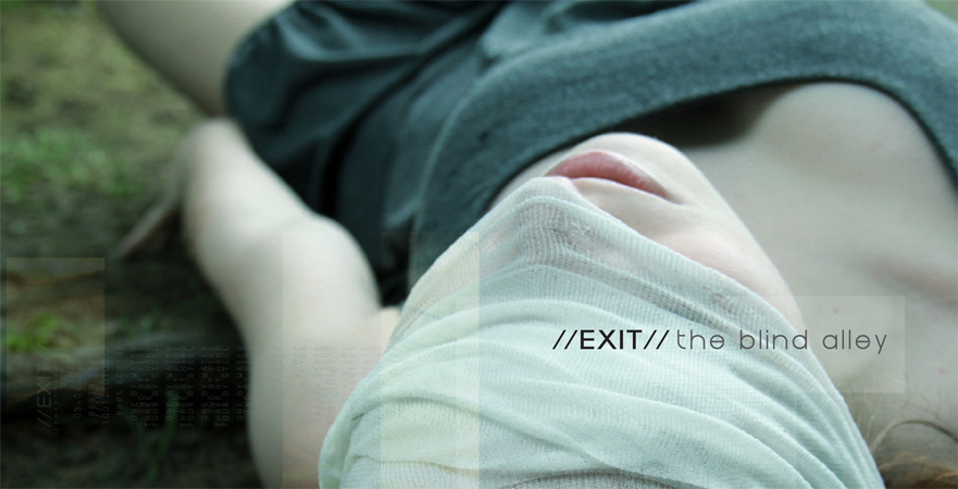
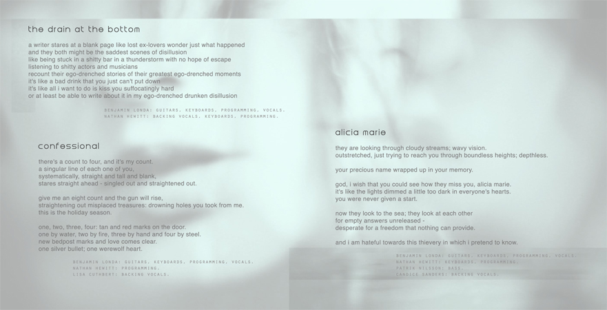
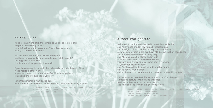
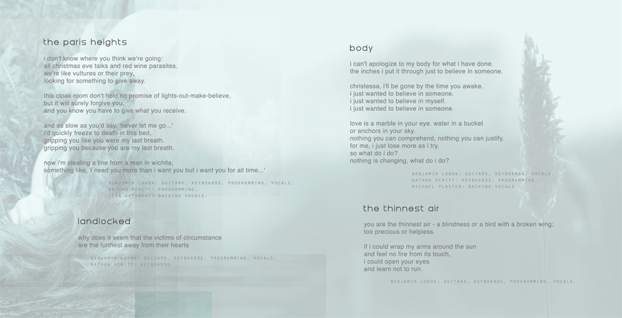
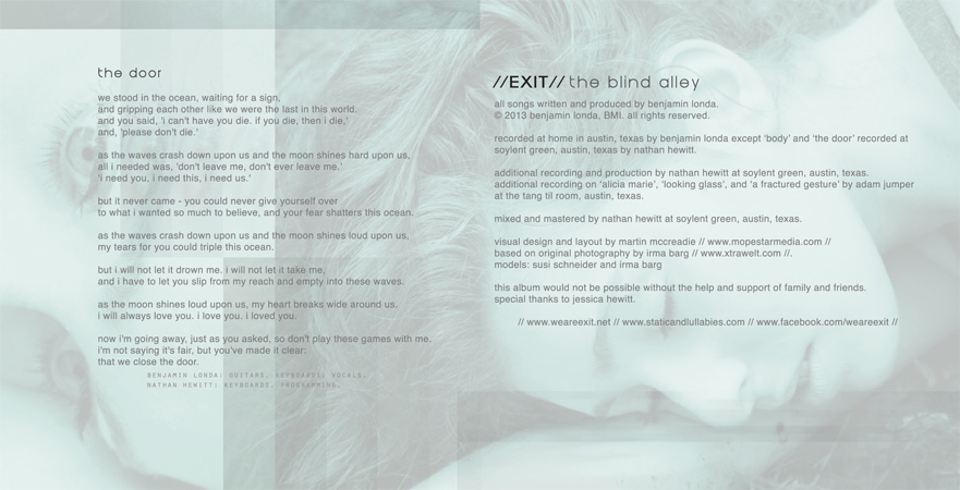
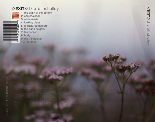
notes: This design is the result of manipulated causality. After my first discussions with Ben Londa of Exit, I was supplied with a series of images that were intended to be included in the packaging. At first glance, these images had little correlation; small flowers, a decaying train, a bandaged woman lying in grass, and cracked glass. Not only did these images lack an inherently cohesive theme, they held different color palettes. The standout though, was a four image set of a woman, face bandaged, in a patch of grass. These photos, by Irma Barg, were extremely emotive with an indescribable dreamlike quality, and quickly became the base for the rest of the design. I decided to fill out the package by weaving seemingly unrelated details through the use of digital glitches and overlaying slices of repetition. The result is much like a dream; an indeterminate but memorable story. To help pull the design together, the dream elements were also filtered to create a cohesive muted color palette on top of which lyrics and liner notes are displayed. Since I had really good source material to work with, the imagery came together quite quickly. On the other hand, the title and band name were created and recreated many times and with much discussion. The typography used in the final design is near exact to my original sketch but ended up going through many changes in an attempt to be more sketchy or handwritten before arriving back at the original idea. It became clear that no matter how interesting the more sketchy versions looked, they were not right for the design.
detail views:
